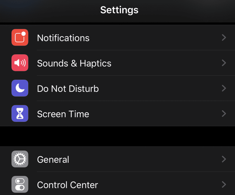
Keep in mind this isn’t an exhaustive review of every new thing in iOS 13 — just a rundown of some of our favorite new things (and one thing that’s not quite so welcome).
Dark mode
Probably the most aesthetically appealing feature is Dark Mode. Whether you’re a charcoal purist or not (we’ve certainly got our Dark Mode haters here in the office at TNW), it’s nice to finally have the option. And if you like it very dark, then I have good news for you: for the most part, this Dark Mode isn’t just gray but pure black. We’re talking black backgrounds on most default apps, and it’s a delight if you’re like me and use your phone at night way more than you should.
Dark Mode can also be customized to switch on and off at particular times. If you’re familiar with Night Shift — which makes you iPhone screen warmer at sundown to help your brain wind down before bed — it works much the same way. You can also add a Dark Mode toggle to your Control Center, so you can turn it on and off at a moment’s notice. I only have one quibble against the Dark/Light mode juxtaposition: prior to this, I could differentiate between a regular Safari tab and a private one by the fact that private was in dark mode by default. Now there’s no quick visual indicator. It’s a very minor complaint in the grand scheme, but still one I felt was worth mentioning.
Swiping
The new keyboard also supports swiping to type. As someone who uses tapping thumbs with the alacrity of a Mavis Beacon graduate, it took a little bit for me to get used to, but it works just great. It’s also a little strange to have to swipe the whole word before it appears on screen (I assume some AI black magic fuckery is at work to make the words appear so beautifully out of my haphazard key-tripping), but I don’t hate it by any means. There are some hiccups: for example, if you swipe and the word is not quite what you wanted, pressing the delete key deletes the whole word. But, as with Dark Mode, it’s definitely nice to finally have the option. I’m sure if you prefer one-handed typing, this might change everything for you.
Photos rejiggered
Your photos are now sorted by years, months, and days in the Photos app. The photos are also laid out in a more appealing way, not being crammed together in same-sized tiles. It’s hard to describe how much better it is: suffice to say it looks more like an album and less like a filing system. The editing and retouching software is now much more intuitive. Before this, it was just one step up from Microsoft Paint, but now the tools are actually useful and (for me at least) usable. You can adjust white balance, vibrancy, noise reduction, sharpness, and probably even more minute things I’m sure Napier knows more about than I do. This new Photo library probably goes hand-in-hand with the camera updates Apple is rolling out with the new slate of iPhones. With better cameras come better pictures, and it’s good to see Apple has updated the software to match them in quality.
This octopus
There are three new Animoji: a mouse, a cow, and an octopus. The latter is my favorite. I mean look at it.
Look at this fucking octopus!!
Bugaboos
There’s one elephant in the room we should probably address, and that’s the bug reports that are rolling in aplenty from people who have updated. Users have reported crashing apps and camera problems. My biggest issue is that some of my Photos have been randomly reassigned dates and times when they definitely weren’t taken — I noticed this while browsing the library and spotting a photo taken in 2013 in my 2017 folder. The bugs are apparently so numerous and harmful the Department of Defense is reportedly cautioning its employees against upgrading until iOS 13.1 comes out. Apple has bumped the release date of the latter to September 24, and it’ll hopefully address some of the issues.


