No matter what the problem, I’ve got three changes that will help you get unstuck so you can achieve your goals.
Number 1: Pass the 3-second test
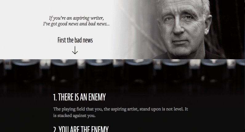
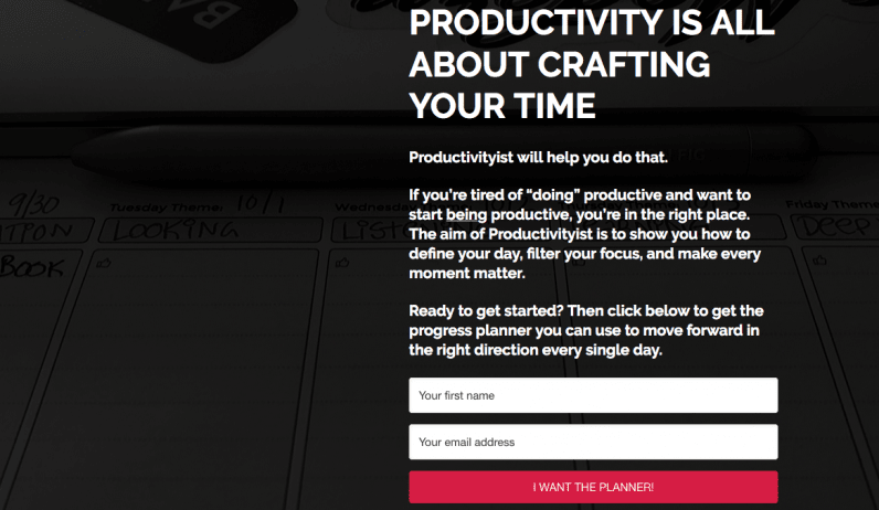
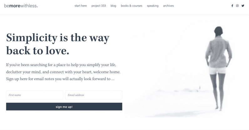
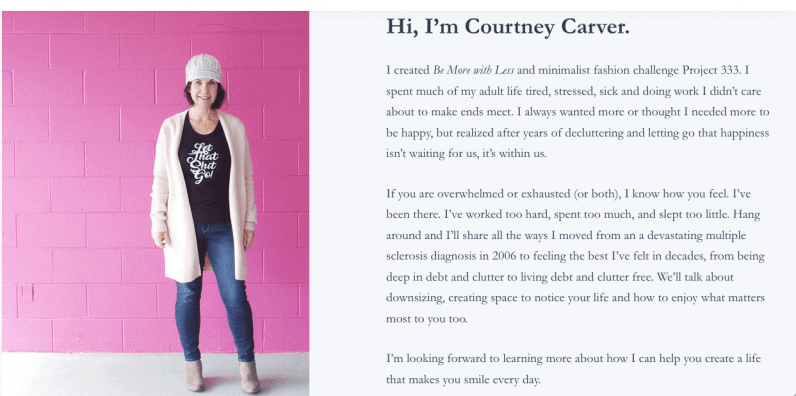
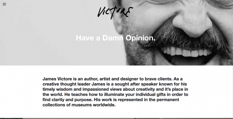
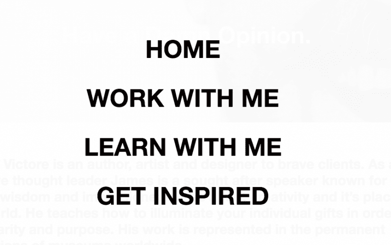
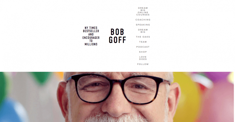
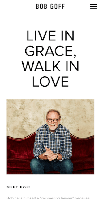
Credit: Stevenpressfield.comSteven Pressfield’s website is for people that want to be writers. Note that the word “aspiring” appears twice in the text. He’s even made his page so you can’t help but scroll down further. That arrow makes any writer or artist want to keep scrolling. Steve is using a “story loop” in that he’s not giving you the whole story at once, just part of the story. This is really important because your brain wants to close story loops. In most cases when you see an email that your brain just tells you to click, a story loop is being used. You want to find out the answer. Here’s another example: Mike Vardy’s website Productivityist. The website is all about helping you be more productive by crafting your time. Not only does Mike tell you exactly what the website is about, but he also offers you a planner to help you make progress in exchange for an email address. Credit: Productivityist.comAnother example is Courtney Carver’s website called Be More With Less. Courtney’s website is all about simplicity and simplifying your life. Credit: bemorewithless.comCourtney’s website has that at the very top of the webpage. What’s the website about? The very first word mentioned: simplicity. Okay, that’s a good start. But it’s more than simplicity. See the next sentence. It’s about a place to help you simplify your life, declutter your mind, and connect with your heart. That image used gives a feeling of peace and rest. That’s huge. So many opt-ins don’t have any image at all. Let’s dig a little deeper. Here’s what is next on Courtney’s webpage. Credit: bemorewithless.comYou have a summary Courtney’s life story in these three paragraphs. But it’s not just her story, it’s also focused on your story as the visitor. That’s a really important thing worth focusing on. At least half of the text is about you. Courtney is the guide, and you’re the hero. The website is about your personal journey. How can you not like that. Don’t fall for that trap. It’s not about having a bright, shiny website that has as much information on it as possible. More does not lead to a better user experience. Small changes can make all the difference. Here’s one example: Credit: jamesvictore.comI really enjoy James Victore’s content, but his website just has too much text there on the homepage. Just taking out a sentence or two would make things a lot clearer and also give more impact. My two tweaks to really give more clarity would be to have author, artist, designer as the subtitle instead of “have a damn opinion.” While that’s a great message, it really doesn’t resonate as much with the first-time guest. That simple tweak can cut the clutter in the text and give a lot more clarity. Thankfully, James does give some clarity in that little menu in the left corner. Here are the choices on the menu in the top left corner. Credit: Jamesvictore.comI would even argue that “learn with me” and “get inspired” don’t have enough distinction. But having only three real choices here does give clarity. Let’s look at another example. Credit: Bobgoff.comThis is the website for Bob Goff. Bob is a bestselling author and speaker. But his menu to the right just has too many choices. Even how the text is listed vertically makes it hard to read on a computer. A first time visitor won’t know what The Oaks, Dream Big, or Love Does mean. A simple tweak of just having four menus listed horizontally would really clear things up. I recommend having Speaking, Coaching, Shop, and Resources as menu items. The resources menu could include things like The Oaks, Team, Podcast, and Dream Big. That would clean up the website and make things clear.
Remember: Less is almost always more when it comes to websites
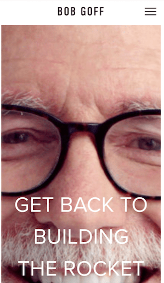
Most views are on mobile devices. In 2019, 58% of site visits were from mobile devices. That’s almost 60% or 3 out of 5 views. Do not overlook this fact. Here’s what I see when I pull up Bob’s website on mobile: Credit: Bobgoff.comThe homepage image isn’t fit for mobile, and the text doesn’t really fit either. This could have been a website theme update, the website is not optimized for mobile, or even something else. However, as you scroll down, the website looks absolutely fantastic. Credit: Bobgoff.comSo be sure to pull up your own website on mobile to see how it looks. Always think about the user experience. Small changes really add up. You want the end-user to have an outstanding experience.
Number 3: The next step
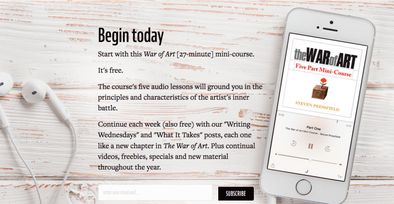
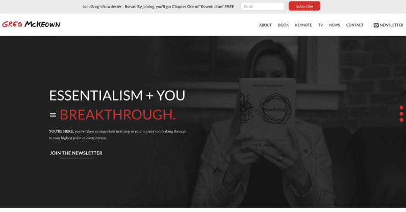
Let’s look back at the very first example with Steven Pressfield. Steve does a great job with this, just take a look at this call to action on his website. Steven’s bestseller by far is his book War of Art, so he uses an audio mini-course as the feature to get more email subscribers. Credit: stevenpressfield.com/aboutLet me share one final example with you that takes things to another level. This is the website of author Greg McKeown. He has a next step for the customer that he mentions not one time, not two times, but three times. Credit: GregmcKeown.comSee the box at the top? That’s an invite to sign up for his newsletter. The call to action for his image is to join the newsletter. To the far right with the envelope logo is the link to his newsletter too. I know it’s very subtle, but these small changes really add up. Best of all, despite asking you to take the next step three times on one screen, this doesn’t come across as pushy to the end-user.
The takeaway
This article was originally published by Jim Woods on Better Marketing, a publication providing advice that works and covering digital and social media marketing, tools, and case studies. You can read the original piece here.
